Thank You and Goodbye

     It's been a long time since I last updated the blog with anything remotely related to technology. While I do still love messing around with consumer tech products, I could no longer find it in me to write a long review or step-by-step guide without getting distracted by other things, be it urgent or just mundane everyday things. Come January 9, 2016, the domain, KENYSL.com will expire and I do not plan on renewing the domain as I find it unnecessarily expensive to renew it with Exabytes. The blog will probably move back to its old domain, kenysl.blogspot.com come January 9, but hyperlinks linking the site from anywhere will be broken and things around the site may prove to be wonky. I would just like to thank all the visitors for coming to the site, proving that not all reviews need to be 'polite', and that there are people wanting some real feedback instead of maneuvering around problems just to appease sponsors.

     Thank you, and goodbye. -Ken

i-Rocks IK6 Crystal Keyboard Review


     It's a whole new month and here I am again, this time, with a review of the i-Rocks IK6 keyboard. Sporting basically the same key structure as the fan-favourite i-Rocks K10, does the IK6 bring anything new to the table, or is it just the K10's different looking younger brother? Let's find out.

WHAT'S IN THE BOX

The keyboard itself and a piece of information

TECH SPECS
REVIEW
     Starting off with the packaging, i-Rocks opt with a much more minimalist design for their box this time, probably to match with the very nice aesthetic that the IK6 sports, more on that later. There's shrink wrap all around the keyboard to protect the keyboard from scratches as such. Overall, enough protection for the keyboard to safely endure shipping.


     Moving onto the keyboard, in the looks department, based on the title of this post alone, you can already guess that it has a transparent bottom already. I was very impressed by the overall look of the IK6, and that was just looking at the black version; the white version looks far more superior, in my opinion, judge for yourself. I find that this keyboard could fit in an office pretty well, as it looks way more subtle compared to other gaming-grade keyboards.

     Speaking about gaming, the keyboard still features some of i-Rocks gaming features like Windows-key lock, as well as a 26-key anti-ghosting area for those that can type that fast. So, if any gamers out there that would like a nice looking keyboard, you can go for the IK6 without sacrificing any essential gaming features.


     Build quality wise, I would say that most of the sturdiness of this keyboard comes from the glass casing on the back. There's basically no flex to the casing even when I try to bend it, so it's goes without saying that under normal usage conditions, that there's no need to worry.


     Connection wise, you get a USB connection with a cable length of 1.5m. That's an ample amount of cable. However, due to the glass casing, users don't get the run-of-the-mill cable routing lanes as seen on other i-Rocks keyboards that I have reviewed in the past, so do keep that in mind.


     Typing experience wise, while it does utilize the same key structure as the fan-favourite K10, it feels slightly different compared to its predecessor. While it is hard to put it in words what the difference between the two is, I'm still going to give it a go; the IK6 is not as "clicky" as the K10. Depending on your preference, this might or might not be a good thing. For me, I like the "click" sound that I make while typing, even though people tell me that it's due to my incorrect way of typing. Overall speaking, while it doesn't feel as good as the K10, the IK6 is still way better than most membrane keyboards that I have used in the past. Oh and finally, a FULL SIZED BACKSPACE, the short backspace normally found on i-Rocks keyboard is the bane of me.

CONCLUSION

     I'm out of words to describe the IK6, so I will just go ahead and conclude everything the IK6 is and isn't. The IK6 is a beautiful looking keyboard, that performs similarly to the K10, albeit being slightly off compared to the superior K10. This slick looking keyboard also complements a work/office space fairly well, so if you are in the market for a keyboard that is fairly professional looking, I wholly recommend the IK6. The i-Rocks IK6 retails at MYR 179.00. For more information, you can refer to i-Rocks Malaysia Facebook Page or their official website.

i-Rocks Golem Series K50E Keyboard Review


     After reviewing one of my favorite non-mechanical keyboard, the Rock Series K10, i-Rocks sent me another one of their upcoming products, the Golem K50E. Will this keyboard blow my socks away like the K10 did? Let's find out.

WHAT'S IN THE BOX?

The keyboard itself, a PS/2 to USB adapter and a user manual

TECH SPECS

REVIEW

     Starting off with the box, the K50E comes in a fairly straight-forward package. The keyboard is secured by in the box by cardboard and that's it. In which I say is enough protection for a keyboard. While there isn't any sort of 'unboxing experience' per say, I'd wager that you bought a keyboard for a keyboard, and nothing else.


     Moving on, let's look at the keyboard instead. In the looks department, the K50E looks about the same like the K10, albeit this time with a whole lot more red accents compared to the latter. Like the K10, the K50E sports a plastic finish all around, be it the keycaps or even the base of the keyboard. The only obvious logo on the keyboard would be the one on the space bar while another two logos are spotted at the bottom and the top-side of the keyboard, both of which will be not visible in normal usage conditions. Build quality wise, despite not being as heavy as its predecessors, the K50E still feels solid overall.


     Connection wise, you get a USB 2.0 connection with a 1.8m cable. The cable also comes with a color-matching velcro for easier cable management. The keyboard also comes along with a PS/2 adapter which some people reign superior over a USB 2.0 connection, but that's a whole other discussion for another day.


     Turning the keyboard around, we find a bright red finish down at the bottom. While users can't really see the red on the bottom of the board, they will see a slight accent on the sides, which is a nice touch. On the bottom, we find a kick-stand with ample amounts of slippy pad and more slippy pads around the keyboard. There's also a cable management lane which users can utilize depending on their preference where it would be better to have the cable route out of.


     This time round, the K50E finally sports some sort of backlight. The keyboard is lit up using a single light source that diffuses throughout the keyboard. This results in a dimmer lit keyboard compared to keyboards which are individually backlit. While I would certainly like to have the keys individually backlit or you know, brighter, I understand that i-Rocks did this to keep the price down; look at the bright side though, this kind of backlight isn't as prone to dying compared to the individual LEDs (probabilities). The red backlight also suits the theme of the K50E that features subtle red accents.

     Typing experience wise, the K50E features a scissor-structure switch, which is vastly different from what the K10 had. While I don't have the technical knowledge to delve deep into how the switch performs and other technical stuff, I can still describe how the keyboard feels from a general user's perspective. It's definitely better than your typical office keyboard, but when compared to a nice mechanical keyboard, it's really no contest. Compared to the K10, I would say that the K50E is a bit less "clicky" than the former which might or might not be a benefit for you, depending on whether or not you are a silence freak. Personally, I prefer the K10 as I'm more of a clickity-clack person. Keyboard layout is same as the K10, which again, reminds me of its short backspace key. I never did understand it anyway.

     Functionality wise, you get the usual Windows-key lock function, 24-key anti-ghosting area, as well as what i-Rocks calls as 'Turbo Typing', which is basically just increased repeat rate, good for Quick-Time Events (QTE) which are very prevalent in modern AAA games. If you read the K10 reivew, I still hold my stance that software integration will definitely do wonders for i-Rocks, especially with this keyboard; if users could switch between different modes of lighting, record macros and the like, it will be superb.

CONCLUSION

     On a final note, I find the K50E a pretty good keyboard; solid build quality, comes backlit, nice and silent to type on, and has some nice functions like adjustable repeat-rate and the quintessential windows-lock. This time round, the K50E retails at MYR 229.00, which compared to the K10 is quite steep. Judging from the addition  of a backlight as well as a different key structure, the price is pretty much justified at i-Rocks side. However, at this price, I find it hard to recommend as there are baseline mechanical keyboards that are priced only 20-30% higher than the K50E. It's up to you to weigh the scales between having a backlight and having a slightly better typing experience.

Taking Windows 10 Technical Preview Out For a Spin


     The Windows 10 Technical Preview has been available to public for quite some time now. While I did try it out using VMs during the earlier builds, it wasn't until when Microsoft enabled Cortana in Build 9926 and announced the free upgrade to Windows 10 for both Windows 7 and Windows 8.1 users; that I installed it into a true partition. This post will be about my experience using the Technical Preview as well as some pointers for you all wanting to be prepared for the free upgrade.


     Before I get started, if you are interested in getting into the action yourself, installing the Technical Preview is easier than ever; just get the Windows 7 USB/DVD Tool (link) and the Technical Preview ISO (link). The procedure is pretty self explanatory and if you are still confused, I am afraid that you are not prepared (sick reference, bro). Also, this post is written in the perspective of someone who has switched to Windows 8 from the get-go and didn't find it as frustrating as the general consensus has it be.

     Installing the Technical Preview was as easy as any other OS installation and if I recall correctly, didn't take as long as my Windows 8.1 install, but not by much though. If you are coming from Windows 7 or any previous OSs, I recommend that you do not connect your PC to the internet to ensure that the initial setup process. For Windows 8.1 users, go ahead and sign in using your Microsoft account so that things like IE settings and wallpapers will get synced to your new Windows 10 ecosystem.


     From the get-go, the most noticeable difference one will see would be the addition of a search bar on the task bar. This search bar is what Cortana is. Users can either type their search queries in the search box or use voice activation. To be honest, it's faster and way more reliable to just open up the browser of your choice and type what you want to search for. As for searching on local disk, I didn't notice any significant differences in terms of speed. Talking of local searching, if you didn't like how local searching worked for Windows 8.1, don't hold your breath for Windows 10. Typing 'control' in the search bar, the first result instead of being the comprehensive 'Control Panel', the OS gives you the inconsistent 'PC Settings' instead. While I am used to this (yup, Win8 behaves the same way), I still find it a mild annoyance especially for new users coming from Win7.


     Speaking of the 'PC Settings' interface, the inconsistencies doesn't stop at just being confused as a control panel, in fact, it is just plain dumb. One would assume that clicking into the 'Personalisation' sub-section would give users access to all customisation options including things like changing wallpapers, colour schemes, and all the other doo-dad; but nope, we have that option in another menu instead. Maybe if they just changed the tool-tip according to what the menu actually does. It wouldn't create these issues. Of course, that is not the only example of redundant menus, I could go on all day long about the 'PC settings' menu, but the post has to go on.

     Oh, and if you didn't notice already, the start menu is back! Now with Metro a.k.a the Start Screen integrated into it. If you are one of those rare few that like the Start Screen, you can still click the full screen button found on the right top corner to bring back the Start Screen. Apparently, I read that one could re-size the start menu to be taller, but I can't for the life of me re-size it. No matter, the quirks of being a Technical Preview I guess.

     From the screenshot above, you can also see that Microsoft went ahead and changed how the taskbar behaves in relation to active and inactive windows. Have a better look at it here.


     On the left, you will see that the file explorer icon on the taskbar only has a little grey-ish line due to it being inactive and the 'PC Settings' icon being grey-filled due to it being the currently active window. I'm not too keen about this change but perhaps people would like the minimalistic (?) approach.


     On topic of active and inactive windows, Microsoft has also brought a very nice feature from OSX into Windows 10: the workspace/task manager/whatever it's called. Now, you can have multiple workspaces and switch between them seamlessly using the task manager button beside the search bar or using the "Windows Key + Tab" shortcut key. This is great news for people like me who tend to have too many windows open while multi-tasking, now I can properly manage work from pleasure! (curse you Steam and Reddit). This is pretty much my favourite feature to come out of this Technical Preview.


     Onto the system apps, Microsoft has pretty much changed how 'Modern' apps behave. Now, users can use modern apps like any other desktop app, with the ability to run it in a window, or fullscreen. I think this is one of the most requested feature from users of Windows 8/8.1. However, for whatever reason, the OS still defaults to the redundant file openers like Photos, Videos and Music (apps designed by Microsoft with modern-esque accents). While it only takes one click to change it back to our trusty old Windows Photo Viewer, it still presents itself as a mild annoyance.


     On the other hand, Windows 10 also comes packaged with a technical preview for Internet Explorer. I don't have much to report about that. I think it's just a way for web developers to determine their websites are displaying correctly in IE. There's even a button for users to report to the IE team if they see a website not being properly displayed in IE.

     There are a ton of minor adjustments made to Windows 10 compared to Windows 8. I could probably go on and on if I had to describe everything in this post, but nobody is going to read that. So as a closing note, is Windows 10 usable? Pretty much yes. For those who are on the bandwagon that Windows 8 is the worst thing to ever happen to Windows after Vista, perhaps it is not for you because I find Windows 10 a slightly modified version of Windows 8, instead of an improved version of Windows 7. If you have any other questions about Windows 10 before making the jump, feel free to leave them in the comments down below. Until then, see you in the next post (if I can figure out what to write).

Measuring Your PCs Performance (Guide & Thought Process)


     It's been about a month since I built the Puffer, As soon as I got it, I went along my merry way and just gamed through the weeks. Since my hype about my new rig is a tad more worn down now, I decided to stress test my PC to see how it's doing. If you want to read up on the rationale behind this build, read my build log over here.

     Before we get started, we have to get our tools ready. Below is the list of tools I have used thus far.


1. AI Suite 3. Adjust voltages and clock speeds without having to go through the hassle of booting into the BIOS. There's also a bunch of other goodies packed into the software. Awesome tool to utilize if you have an ASUS motherboard.

2. Realtemp. Just a simple and reliable temperature monitor.

3. AIDA64. I chose this over Prime95 due to... due to... actually I have no idea why but I went with AIDA64 anyway. Either one of these will work fine.

4. ASUS GPUTweak. One of the many GPU overclocking tools to choose from. I have an ASUS card so I figured I would use this instead of MSI Afterburner.

5. 3DMark. Bought this on the last steam sale. Of course synthetic benchmarks are not an accurate representation of how a rig will perform during real games. However, in this age of "screenshots or it didn't happen", 3DMark standardized benchmarks works better numbers wise.

6. Unigine Heaven Benchmark. I see a lot of reviewers use this to demonstrate their point so I guessed I would try it as well.

     Before I went around tweaking stuff, I did a dry run of AIDA64's stress test and to my surprise, my 4790K was throttling due to constantly hitting almost the 100C mark. After some intense Google searches, I figured that I didn't tighten my CPU block enough. After tightening the CPU block, I did another run, the throttling stopped, but the temps were still around 80C give or take 5C.

     After some further reading on the interwebs, I learned that my CPU voltage might be the culprit. Opening up AI Suite 3, my motherboard has default to using adaptive voltage which resulted in the CPU using about 0.2v more than the recommended voltage. After dialing down the CPU voltage to 1.130v, I also "underclocked" it to match the stock Intel settings of 3-cores 4.3GHz and 4-cores 4.2GHz instead of ASUS's default all cores 4.4GHz.


     With everything ready to rumble, I ran another AIDA64 run for about 30 mins to test for stability and the results has shown to be consistent with other users on the interwebs. At 100% loads, I averaged around 73C which I was pretty satisfied about. I could probably turn down the voltage a few more notches to optimize the heat output but for now I guess it's fine. Oh, and my idle temps are around 34-36C if you were wondering.


     Since I have pretty much fixed my initial problem, now it's time to tend to my graphics card. I checked the "overclocking range enhancement" so that I can increase the max GPU voltage and push the core clock even further.


     Below are the important numbers, before and after overclocking. You can use the numbers to overclock your Strix 970 but sometimes it just won't work. Something to keep an eye on would be the memory clock as I have seen other people get much better memory clocks than mine so don't worry about it too much. Oh and to determine whether a overclock is stable or not, just run a demanding game and see if any artifacts appear, if no, you are good to go.


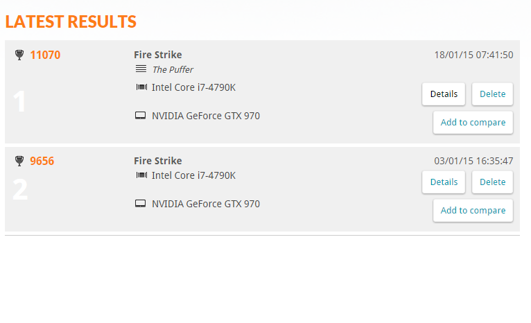
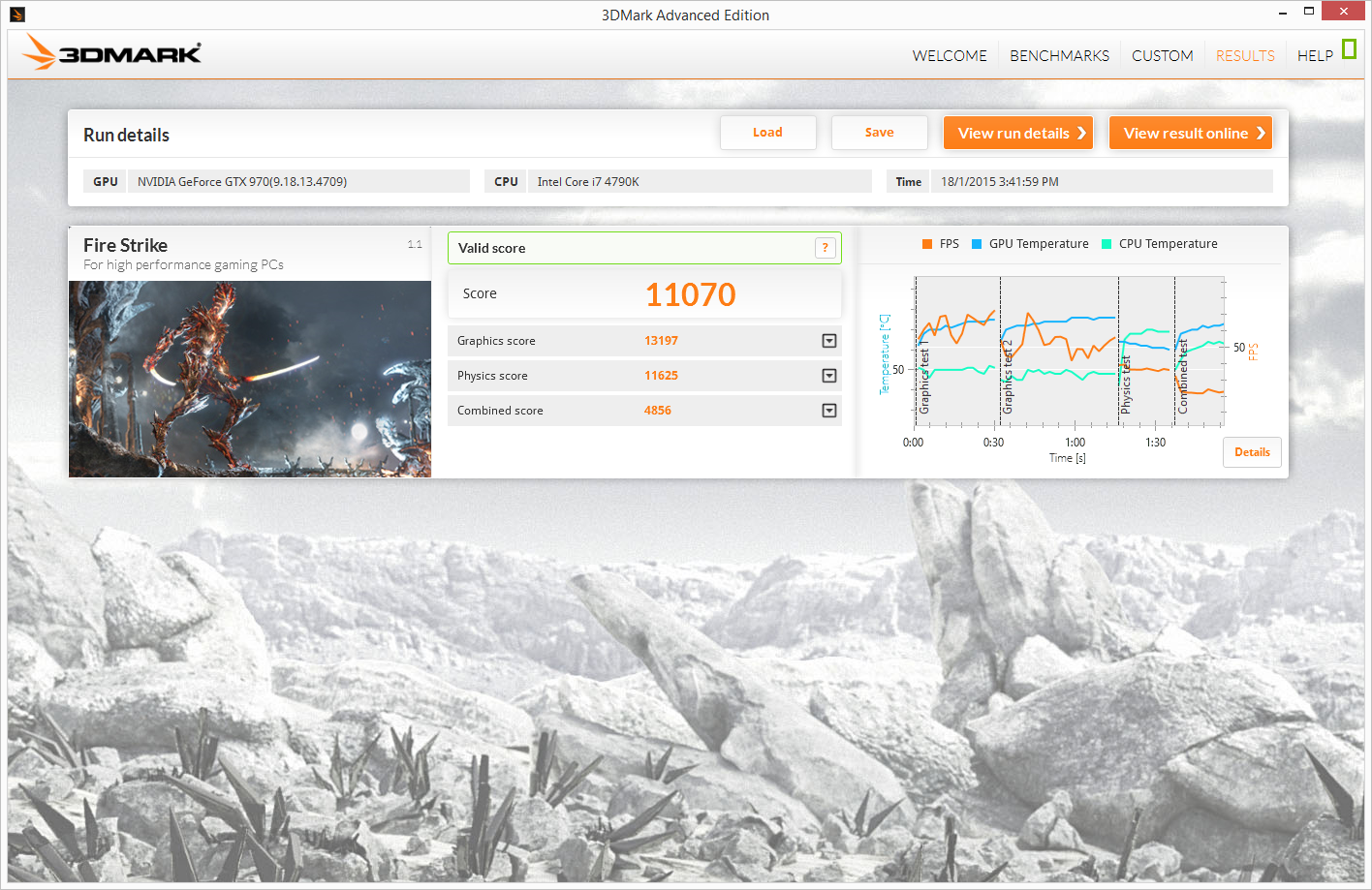
     I ran a 3DMark Fire Strike test at the beginning of the month to see how well my card performed and my rig scored 9656. After overclocking, my rig scores 11070 which is a lot of improvement per say; just goes to show that NVIDIA's Maxwell architecture is a great overclocker. I have some screenshots below and here's the link to the results of pre and post overclocking.


     Last but not least, I ran Unigine Heaven to measure "more realistic" performance (according to reviewers at least). I scored 1538 at 1080P Ultra with extreme tessellation and 8x AA. Remember when you compare scores with others, make sure you are using the same settings as them to avoid unnecessary confusion.


     That about sums up everything I did for performance tuning and benchmarking. I'm still looking for other tweaks that may improve the performance, so if you have any other pointers I should follow, do leave a comment down below and let me know.

Ken's Best Of CES 2015


     This year's CES has come to an end and here I am again, summing up what I find interesting throughout the annual event. These products/concepts are some of my personal favourites that were revealed during the event. While I don't cover everything that's happened during the event, I find that TechCrunch and The Verge provide some of the best coverage on this year's event so check out their coverage if you are keen on learning about everything CES.


ASUS ROG Swift PG27AQ 27-inch 4K G-Sync Monitor (link)
     ASUS's ROG Swift PG278Q swept everyone off their feet when it was first released as it was the first 1440p monitor to have G-Sync support. G-Sync is NVIDIA's propitiatory standard which allows monitors to refresh only when the display card outputs a new frame. To learn more about G-Sync, you can visit NVIDIA's page here. In short, it provides a smoother and much more enjoyable gaming experience for consumers. This time around, ASUS has addressed one of the major issues that reviewers/users have pointed out, the TN panel. The PG27AQ features a 4K IPS panel which allows for better colour reproduction and overall better image. Of course, the only drawback is the downgrade to 60Hz but as of now, only a handful of people can drive 4K above 60fps so that's fine in my eyes. Overall, a good upgrade to an already amazing monitor.
pictured: LG 34UM67
AMD FreeSync Monitors (link)
     AMD is off to a good start with its FreeSync technology, a direct competitor to NVIDIA's G-Sync, with the introduction of 9 FreeSync supported monitors, which if I recall correctly. is already more than the number of G-Sync supported monitors despite its earlier launch. Competition is always good for consumers as it keeps competing companies on the edge, always trying to top each other. My favourite among the 9 monitors would be the LG ultrawide monitors. I always wanted a 21:9 aspect ratio monitor but could never find one here in good ole Malaysia; the only LG products I can seemingly find are washing machines and refrigerators. Oh well, such is the vain of living in a developing(?) country.


NVIDIA Tegra X1 ft. Drive CX and Drive PX (link 1 link 2)
     I swear this is the last item on the list that has to do with graphics chip manufacturers. Remember the Tegra K1? Meet its little sister, codename Erista (Tegra X1). The Tegra X1 continues to improve on the K1's already very powerful display and processing capabilities. Utilizing NVIDIA's latest Maxwell architecture, the X1 effectively reduces power consumption without compromising its performance. While that doesn't sound too exciting, wait till you hear this: self-driving cars that can learn. Yes, utilizing the Tegra X1's amazing processing capabilities, the Drive PX is able to drive itself around the a course with some learning; which goes to show how powerful its real time processing is. Drive CX on the other hand, is a digital cockpit interface for vehicles, which looks pretty impressive on its own. I will attach a video below from the NVIDIA press conference.


ASUS ZenFone 2 (link)
     ASUS is on the list again, this time for the ZenFone 2. The reason the ZenFone 2 is on this list is for its amazing value; the base 16GB/2GB model is priced at a mere $199. Also, an interesting thing on the spec sheet is the Intel Z3580 processor; I want to see if Intel could break the monopoly that Qualcomm has over the industry on flagship phones. Still not a big fan of the on-screen buttons though.


Razer Turret (link)
     What is a CES list without Razer in it, am I right? While Razer did reveal the Forge TV Android gaming console, what interests me more is the implementation of mouse & keyboard for this particular setup. While this combo is not a entirely new concept (ROCCAT Sova), it's nice to see a much more compact and subjectively more stylish implementation. The mousepad is also magnetized to ensure that the mouse doesn't just fall off, which is a nice touch if I might say.

Honorable Mentions


ALCATEL ONETOUCH's Watch (link)
     This would have been one of the top things on my list, if only it ran on Android Wear. A $150 Android Wear running circular watch that looks nice? Sign me up for that.


MSI GS30 (link)
     If you didn't know, I am not a big fan of having to sync multiple devices especially when it comes to personal computers which contain some of my very important work. The GS30 is a lightweight laptop on-the-go and a graphics powerhouse when you need with a simple docking mechanism. Now MSI, make it cheaper and I will bite. With all that said, I really want this concept to take off so I don't have to panic when one of my documents are synced with the cloud.