It's a whole new month and here I am again, this time, with a review of the i-Rocks IK6 keyboard. Sporting basically the same key structure as the fan-favourite i-Rocks K10, does the IK6 bring anything new to the table, or is it just the K10's different looking younger brother? Let's find out.
WHAT'S IN THE BOX
The keyboard itself and a piece of information
TECH SPECS
REVIEW
Starting off with the packaging, i-Rocks opt with a much more minimalist design for their box this time, probably to match with the very nice aesthetic that the IK6 sports, more on that later. There's shrink wrap all around the keyboard to protect the keyboard from scratches as such. Overall, enough protection for the keyboard to safely endure shipping.
Moving onto the keyboard, in the looks department, based on the title of this post alone, you can already guess that it has a transparent bottom already. I was very impressed by the overall look of the IK6, and that was just looking at the black version; the white version looks far more superior, in my opinion, judge for yourself. I find that this keyboard could fit in an office pretty well, as it looks way more subtle compared to other gaming-grade keyboards.
Speaking about gaming, the keyboard still features some of i-Rocks gaming features like Windows-key lock, as well as a 26-key anti-ghosting area for those that can type that fast. So, if any gamers out there that would like a nice looking keyboard, you can go for the IK6 without sacrificing any essential gaming features.
Build quality wise, I would say that most of the sturdiness of this keyboard comes from the glass casing on the back. There's basically no flex to the casing even when I try to bend it, so it's goes without saying that under normal usage conditions, that there's no need to worry.
Connection wise, you get a USB connection with a cable length of 1.5m. That's an ample amount of cable. However, due to the glass casing, users don't get the run-of-the-mill cable routing lanes as seen on other i-Rocks keyboards that I have reviewed in the past, so do keep that in mind.
Typing experience wise, while it does utilize the same key structure as the fan-favourite K10, it feels slightly different compared to its predecessor. While it is hard to put it in words what the difference between the two is, I'm still going to give it a go; the IK6 is not as "clicky" as the K10. Depending on your preference, this might or might not be a good thing. For me, I like the "click" sound that I make while typing, even though people tell me that it's due to my incorrect way of typing. Overall speaking, while it doesn't feel as good as the K10, the IK6 is still way better than most membrane keyboards that I have used in the past. Oh and finally, a FULL SIZED BACKSPACE, the short backspace normally found on i-Rocks keyboard is the bane of me.
CONCLUSION
I'm out of words to describe the IK6, so I will just go ahead and conclude everything the IK6 is and isn't. The IK6 is a beautiful looking keyboard, that performs similarly to the K10, albeit being slightly off compared to the superior K10. This slick looking keyboard also complements a work/office space fairly well, so if you are in the market for a keyboard that is fairly professional looking, I wholly recommend the IK6. The i-Rocks IK6 retails at MYR 179.00. For more information, you can refer to i-Rocks Malaysia Facebook Page or their official website.
After reviewing one of my favorite non-mechanical keyboard, the Rock Series K10, i-Rocks sent me another one of their upcoming products, the Golem K50E. Will this keyboard blow my socks away like the K10 did? Let's find out.
WHAT'S IN THE BOX?
The keyboard itself, a PS/2 to USB adapter and a user manual
TECH SPECS
REVIEW
Starting off with the box, the K50E comes in a fairly straight-forward package. The keyboard is secured by in the box by cardboard and that's it. In which I say is enough protection for a keyboard. While there isn't any sort of 'unboxing experience' per say, I'd wager that you bought a keyboard for a keyboard, and nothing else.
Moving on, let's look at the keyboard instead. In the looks department, the K50E looks about the same like the K10, albeit this time with a whole lot more red accents compared to the latter. Like the K10, the K50E sports a plastic finish all around, be it the keycaps or even the base of the keyboard. The only obvious logo on the keyboard would be the one on the space bar while another two logos are spotted at the bottom and the top-side of the keyboard, both of which will be not visible in normal usage conditions. Build quality wise, despite not being as heavy as its predecessors, the K50E still feels solid overall.
Connection wise, you get a USB 2.0 connection with a 1.8m cable. The cable also comes with a color-matching velcro for easier cable management. The keyboard also comes along with a PS/2 adapter which some people reign superior over a USB 2.0 connection, but that's a whole other discussion for another day.
Turning the keyboard around, we find a bright red finish down at the bottom. While users can't really see the red on the bottom of the board, they will see a slight accent on the sides, which is a nice touch. On the bottom, we find a kick-stand with ample amounts of slippy pad and more slippy pads around the keyboard. There's also a cable management lane which users can utilize depending on their preference where it would be better to have the cable route out of.
This time round, the K50E finally sports some sort of backlight. The keyboard is lit up using a single light source that diffuses throughout the keyboard. This results in a dimmer lit keyboard compared to keyboards which are individually backlit. While I would certainly like to have the keys individually backlit or you know, brighter, I understand that i-Rocks did this to keep the price down; look at the bright side though, this kind of backlight isn't as prone to dying compared to the individual LEDs (probabilities). The red backlight also suits the theme of the K50E that features subtle red accents.
Typing experience wise, the K50E features a scissor-structure switch, which is vastly different from what the K10 had. While I don't have the technical knowledge to delve deep into how the switch performs and other technical stuff, I can still describe how the keyboard feels from a general user's perspective. It's definitely better than your typical office keyboard, but when compared to a nice mechanical keyboard, it's really no contest. Compared to the K10, I would say that the K50E is a bit less "clicky" than the former which might or might not be a benefit for you, depending on whether or not you are a silence freak. Personally, I prefer the K10 as I'm more of a clickity-clack person. Keyboard layout is same as the K10, which again, reminds me of its short backspace key. I never did understand it anyway.
Functionality wise, you get the usual Windows-key lock function, 24-key anti-ghosting area, as well as what i-Rocks calls as 'Turbo Typing', which is basically just increased repeat rate, good for Quick-Time Events (QTE) which are very prevalent in modern AAA games. If you read the K10 reivew, I still hold my stance that software integration will definitely do wonders for i-Rocks, especially with this keyboard; if users could switch between different modes of lighting, record macros and the like, it will be superb.
CONCLUSION
On a final note, I find the K50E a pretty good keyboard; solid build quality, comes backlit, nice and silent to type on, and has some nice functions like adjustable repeat-rate and the quintessential windows-lock. This time round, the K50E retails at MYR 229.00, which compared to the K10 is quite steep. Judging from the addition of a backlight as well as a different key structure, the price is pretty much justified at i-Rocks side. However, at this price, I find it hard to recommend as there are baseline mechanical keyboards that are priced only 20-30% higher than the K50E. It's up to you to weigh the scales between having a backlight and having a slightly better typing experience.
While I am kinda late to the game, at last I had gotten a chance to review the OPPO Find 7 courtesy of OPPO Malaysia. Without further ado, let's get started with this late review of the OPPO Find 7, one of the frontrunners in the QHD game in the smartphone industry.
WHAT'S IN THE BOX?
The phone itself, a VOOC charger, a normal wall charger, MicroUSB cable, earphones and documentation.
TECH SPECS
REVIEW
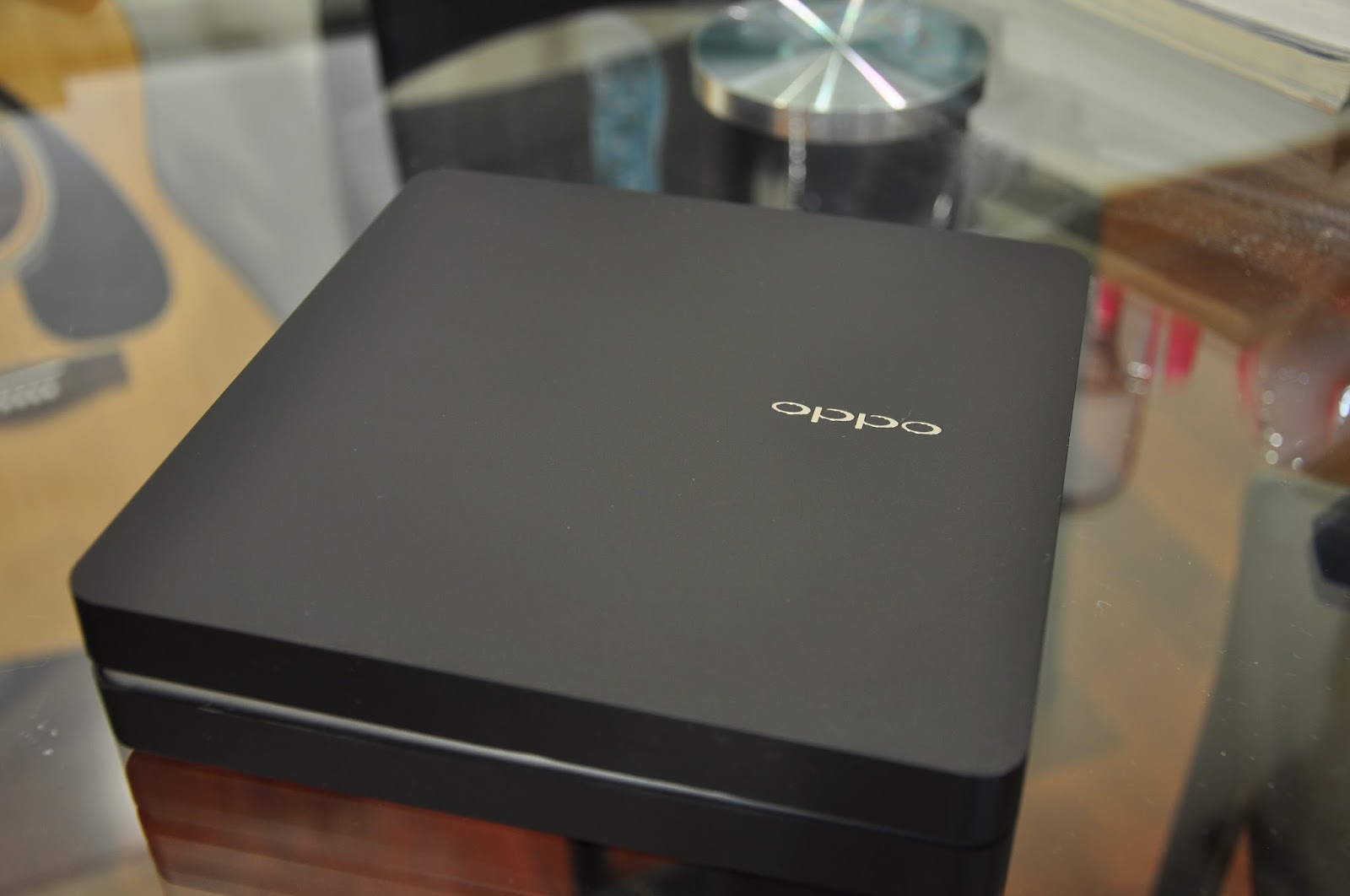
Let's start with the packaging. As usual, unboxing a flagship device from OPPO is truly an 'experience'. Instead of the white box we got with the N1, this time we are treated with a black box made with the same finishing. In the compartment below the phone, we find all the accessories tucked neatly inside.
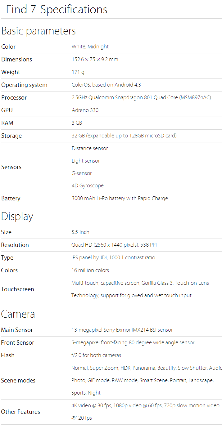
Enough chirping about the packaging, let's shift our focus to the star of the show, the Find 7 itself. Today I have with me the Astro Black variant of the Find 7. The Find 7 also comes in a White variant as well. Looking at the front of the phone, we are greeted with a 5.5" QHD (2560x1440) IPS display, accounting for a whopping 538ppi. In a previous post, I discussed whether it is necessary for manufacturers to push the boundaries beyond FHD (1920x1080) on smartphones; my answer was yes but after trying out the Find 7 myself, I had a change of mind. I also have the Find 7a, an identical twin to the Find 7 with some slight differences including a FHD display instead of a QHD display. Holding them both side by side, I could barely see a difference in terms of sharpness or clarity. Don't get me wrong, the display on the Find 7 is still one of the best displays out there in the market, but as a matter of fact, I would never hold my device close enough for me to notice the smoother edges that a QHD display has to offer. If you would like to read up more on how more pixels affect things, you can read the "Technical" section on this Wikipedia article. So, to answer the question whether QHD is necessary for smartphones, the answer is no; However, is it cool to have? You are damn right it's cool to have one.
Even though it's been a wall of text talking about the QHD display, we aren't done talking about the display yet. An issue that came up right before the release of the Find 7 was a controversy about the colour temperature of the display compared to its FHD counterpart. It was argued that the colour on the display of the Find 7 was not as vibrant as on the Find 7a. To test this out, I've put both the Find 7 and Find 7a side by side displaying the same photo.
Top: Find 7a, Bottom: Find 7
Left: Find 7a, Right: Find 7
From the two pictures above, you can make your own verdict about the displays. My verdict though is that the Find 7's display is a tad pale compared to that of the 7a. Some colours just don't look as vibrant as it should on the Find 7. After comparing a few pictures, I found that some like previously stated, look better on the 7a but some other photos look better on the 7 instead. This is an opinion that varies between person to person so you might want to have a look with your own eyes. Another little qurik I noticed was that the Find 7's backlight was a lot more dimmer on max brightness compared to that of the Find 7a. This is probably related to how hot QHD displays could get on high brightness levels. For context, max brightness on the Find 7 is roughly 75% brightness on the Find 7a or any other phone in fact. With this adjustment, there was no danger of the screen overheating; a good trade-off if you ask me. Oh and before I forget, the OPPO Find 7/7a comes with a screen-protector pre-installed!
Looking further downward, we see the capacitive buttons featured on the Find 7. As an Android purist, the layout irks me as it is still using an ancient layout with a menu, home and back button from left to right. I have no problem with using capacitive buttons but would OPPO please update the layout to back, home and recents instead to comply with Google's design guideline. Anyway, just a minor complaint from an Android fanboy, typical users will be just fine using this layout. Below the buttons, we find a LED strip notification light which OPPO dubs as the 'Skyline' notification light. This is one of the coolest LED notification lights I've seen in a while; while not the first one to be seen sporting this config, it's still pretty much a highlight of this particular phone. One more modification I would like OPPO to make is to have it shine in multi-colour instead of just blue, as I have a need for different shades of notification to tell me whether a notification is urgent or not. Otherwise, a big thumbs up to OPPO for including this.
The sides of the phone are tinted black on this variant on the phone, with the other variant tinted white. On the right side, we find the volume control buttons which is easy to locate for it has a little edginess to it. The power button is located on the left side of the phone which also sports the same edginess found on the volume controls. Both the power and volume controls are easy to locate due to the previously mentioned edginess of the buttons. One-handed operations wise, mispressing wasn't an issue throughout my one month testing period.
Turning the phone around, we get to see the nicely textured back cover. The back cover on this Astro Black variant is smooth to the touch. Visually, the texture is as if it was something that was vinyl wrapped with carbon fibre. With that in mind, what I'm trying to say is that the texture is cool to have.
Opening up the back cover, we see the battery as well as the MicroSIM slot (if you squint your eyes hard enough, you can see the MicroSD slot above the battery on the right). Let's focus on the battery. You can see the wordings 'VOOC' etched onto the lower part of the battery. VOOC is a battery technology which OPPO claims to be able to charge faster and safer at the same time; of course this technology would come with a proprietary charger as seen from the unboxing pictures.
While I can't test whether the battery is any safer than the norm, I can test how fast the battery is able to be charged. Within 10 minutes, using the VOOC charger, the Find 7 was charged from 8% to 33%; giving the phone another 22 minutes, it charged to 80%. Pretty impressive results and from what I observed, there isn't any sort of unusual heating up during charging. Nice to have for those who can't stay in one spot for too long or when you forgot to charge your phone overnight.
Right below the battery, we find 2 honeycomb formations which comprise the speakers for the Find 7. From my experience, I found that these speakers can blast at a pretty high volume. For the first time ever, I don't have my ringer set to maximum volume because the Find 7 on maximum volume is so loud, it was obnoxious for me for the first few days. Of course, this isn't a bad thing because it's not uncommon that some media files to have very low volume. With the speakers as well as OPPO's MaxxAudio implementation, the speakers perform spectacularly well compared to other back facing speakers.
Normal Mode
UHD mode
Since we are done talking about most if not all of the external stuff, let's talk about the Find 7's camera. The Find 7 is equipped with a 13MP f/2.0 lens; but what makes it different compared to other flagships that also fancy the 13MP camera nowadays? Let's find out. Firing up the camera app and going into the 3-dot menu on the top right, we find a few different camera modes; most notably, the UltraHD mode. OPPO apparently implemented a software feature to enable the camera to take photos of 50MP quality by stitching together 10 photos together. Above you will see a photo taken using normal mode, and the other in UltraHD mode.
As seen from the samples, the photo taken in UltraHD mode is significantly brighter compared to that of the one taken in normal mode, which is probably due to how the 10 photos are stitched together. Unless you are someone who processes all your photos through Photoshop (colour balancing & downscaling for crisper photos); I recommend that you should just stay with 13MP as the file size in 50MP mode is 3.5 times larger than photos taken in 13MP mode (10.4MB vs 2.92MB) and you could barely notice a difference on your phone. Speaking about pros, the camera can also output in RAW format for even more intense editing in Photoshop. There are also some other fun modes like voice photo, slow shutter (for those amazing highway night shots), GIF, panorama and not forgetting OPPO's very own beautify which significantly reduces complexions on skin. I have posted more photos taken with the Find 7 which you can find here.
.png)






.JPG)
.JPG)


![[Updated 14/2/2015]How to root your LG G Pro2 (D838) 16/32GB](https://blogger.googleusercontent.com/img/b/R29vZ2xl/AVvXsEjkY8Y7i9l2uFPJopjlnr2KMnfJi0aklEC2b-GYGiPfLMxMbfNZ5YUj2keosvTlxF12NMOuNarLVif_wAUnfbwpPGRyFNU2eo8b6tsEz2u3DDLd5G4wvxD318gViu78Uxk6y0a6M6t9FRcc/s72-c/root+guide.jpg)


![How to root your OPPO Find 7 (X9076) & Find 7a (X9006) Stock/Custom Recovery [Updated for ColorOS 2.0]](https://blogger.googleusercontent.com/img/b/R29vZ2xl/AVvXsEgCiB_-MGvCpPXX28qC4nLbxmdHrFKSqgCPOhx8I8eEC180X3VC_o9YMaLzb80SNqq1aKDarK6y1daaLF6140d60XjT9ZcOd1_PsgQJvRYxXknJW-KNhnfJq27gUvYWa7M2PhUJy-pLPU_g/s72-c/root+guide.jpg)
