OPPO Find 7 Review - Is It Time for QHD?
While I am kinda late to the game, at last I had gotten a chance to review the OPPO Find 7 courtesy of OPPO Malaysia. Without further ado, let's get started with this late review of the OPPO Find 7, one of the frontrunners in the QHD game in the smartphone industry.
WHAT'S IN THE BOX?
The phone itself, a VOOC charger, a normal wall charger, MicroUSB cable, earphones and documentation.
TECH SPECS
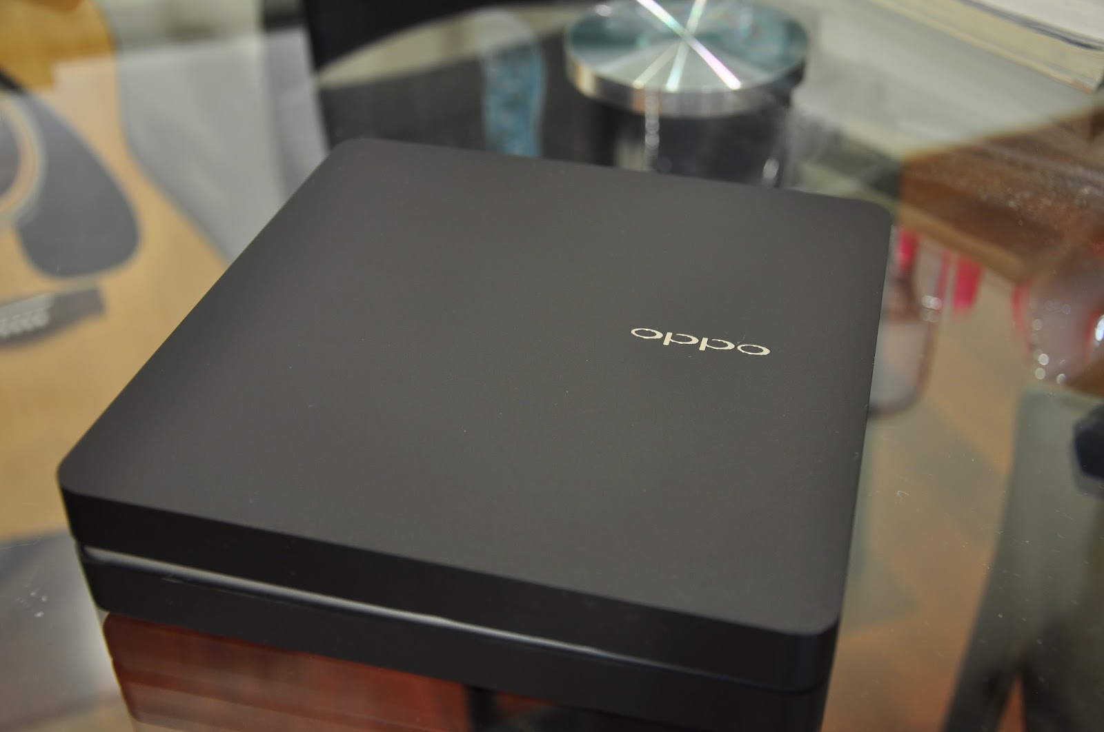
Let's start with the packaging. As usual, unboxing a flagship device from OPPO is truly an 'experience'. Instead of the white box we got with the N1, this time we are treated with a black box made with the same finishing. In the compartment below the phone, we find all the accessories tucked neatly inside.
Enough chirping about the packaging, let's shift our focus to the star of the show, the Find 7 itself. Today I have with me the Astro Black variant of the Find 7. The Find 7 also comes in a White variant as well. Looking at the front of the phone, we are greeted with a 5.5" QHD (2560x1440) IPS display, accounting for a whopping 538ppi. In a previous post, I discussed whether it is necessary for manufacturers to push the boundaries beyond FHD (1920x1080) on smartphones; my answer was yes but after trying out the Find 7 myself, I had a change of mind. I also have the Find 7a, an identical twin to the Find 7 with some slight differences including a FHD display instead of a QHD display. Holding them both side by side, I could barely see a difference in terms of sharpness or clarity. Don't get me wrong, the display on the Find 7 is still one of the best displays out there in the market, but as a matter of fact, I would never hold my device close enough for me to notice the smoother edges that a QHD display has to offer. If you would like to read up more on how more pixels affect things, you can read the "Technical" section on this Wikipedia article. So, to answer the question whether QHD is necessary for smartphones, the answer is no; However, is it cool to have? You are damn right it's cool to have one.
Even though it's been a wall of text talking about the QHD display, we aren't done talking about the display yet. An issue that came up right before the release of the Find 7 was a controversy about the colour temperature of the display compared to its FHD counterpart. It was argued that the colour on the display of the Find 7 was not as vibrant as on the Find 7a. To test this out, I've put both the Find 7 and Find 7a side by side displaying the same photo.
Top: Find 7a, Bottom: Find 7
Left: Find 7a, Right: Find 7
From the two pictures above, you can make your own verdict about the displays. My verdict though is that the Find 7's display is a tad pale compared to that of the 7a. Some colours just don't look as vibrant as it should on the Find 7. After comparing a few pictures, I found that some like previously stated, look better on the 7a but some other photos look better on the 7 instead. This is an opinion that varies between person to person so you might want to have a look with your own eyes. Another little qurik I noticed was that the Find 7's backlight was a lot more dimmer on max brightness compared to that of the Find 7a. This is probably related to how hot QHD displays could get on high brightness levels. For context, max brightness on the Find 7 is roughly 75% brightness on the Find 7a or any other phone in fact. With this adjustment, there was no danger of the screen overheating; a good trade-off if you ask me. Oh and before I forget, the OPPO Find 7/7a comes with a screen-protector pre-installed!
Looking further downward, we see the capacitive buttons featured on the Find 7. As an Android purist, the layout irks me as it is still using an ancient layout with a menu, home and back button from left to right. I have no problem with using capacitive buttons but would OPPO please update the layout to back, home and recents instead to comply with Google's design guideline. Anyway, just a minor complaint from an Android fanboy, typical users will be just fine using this layout. Below the buttons, we find a LED strip notification light which OPPO dubs as the 'Skyline' notification light. This is one of the coolest LED notification lights I've seen in a while; while not the first one to be seen sporting this config, it's still pretty much a highlight of this particular phone. One more modification I would like OPPO to make is to have it shine in multi-colour instead of just blue, as I have a need for different shades of notification to tell me whether a notification is urgent or not. Otherwise, a big thumbs up to OPPO for including this.
Turning the phone around, we get to see the nicely textured back cover. The back cover on this Astro Black variant is smooth to the touch. Visually, the texture is as if it was something that was vinyl wrapped with carbon fibre. With that in mind, what I'm trying to say is that the texture is cool to have.
Opening up the back cover, we see the battery as well as the MicroSIM slot (if you squint your eyes hard enough, you can see the MicroSD slot above the battery on the right). Let's focus on the battery. You can see the wordings 'VOOC' etched onto the lower part of the battery. VOOC is a battery technology which OPPO claims to be able to charge faster and safer at the same time; of course this technology would come with a proprietary charger as seen from the unboxing pictures.
While I can't test whether the battery is any safer than the norm, I can test how fast the battery is able to be charged. Within 10 minutes, using the VOOC charger, the Find 7 was charged from 8% to 33%; giving the phone another 22 minutes, it charged to 80%. Pretty impressive results and from what I observed, there isn't any sort of unusual heating up during charging. Nice to have for those who can't stay in one spot for too long or when you forgot to charge your phone overnight.
Right below the battery, we find 2 honeycomb formations which comprise the speakers for the Find 7. From my experience, I found that these speakers can blast at a pretty high volume. For the first time ever, I don't have my ringer set to maximum volume because the Find 7 on maximum volume is so loud, it was obnoxious for me for the first few days. Of course, this isn't a bad thing because it's not uncommon that some media files to have very low volume. With the speakers as well as OPPO's MaxxAudio implementation, the speakers perform spectacularly well compared to other back facing speakers.
Normal Mode
UHD mode
As seen from the samples, the photo taken in UltraHD mode is significantly brighter compared to that of the one taken in normal mode, which is probably due to how the 10 photos are stitched together. Unless you are someone who processes all your photos through Photoshop (colour balancing & downscaling for crisper photos); I recommend that you should just stay with 13MP as the file size in 50MP mode is 3.5 times larger than photos taken in 13MP mode (10.4MB vs 2.92MB) and you could barely notice a difference on your phone. Speaking about pros, the camera can also output in RAW format for even more intense editing in Photoshop. There are also some other fun modes like voice photo, slow shutter (for those amazing highway night shots), GIF, panorama and not forgetting OPPO's very own beautify which significantly reduces complexions on skin. I have posted more photos taken with the Find 7 which you can find here.
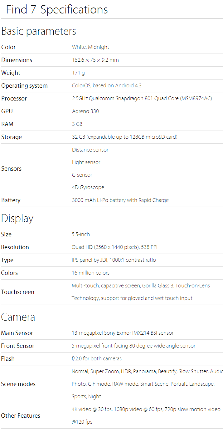
Moving onto internals, the Find 7 sports a 2.5GHz Qualcomm Snapdragon 801 (MSM8794AC), which is pretty for its time of release, and only a bit behind of the new S805. Alongside with a Adreno 330 graphics core and tying things together, 3GB of RAM. The Find 7 is running on Android 4.3 Jellybean, which as of now, is two versions behind the recently announced Android 5.0 Lollipop. On top of the kinda outdated software, runs OPPO's own skin, ColorOS. To read more on ColorOS, refer to my OPPO N1 review as it's basically unchanged. To sum up the usage experience, I do not experience any major slowdowns while using the phone, browsing through pages or playing games; as expected of the top of the line specs.
The phone sports a 3000 mAh battery. From my experience of using this phone for well over a month, I'm able to get through a full day's worth of usage, averaging at about 4 hours of screen-on time. This is with Wi-Fi, mobile data and Bluetooth left on throughout the day. The battery life is average compared to mainstream smartphones, but considering it has a QHD display, it's faring pretty well in that aspect.
Storage wise, the phone has a 32GB ROM, with about 26GB available for user storage. Like previously mentioned, the phone also supports expandable storage via MicroSD cards, with support of up to 128GB. It seems that the pleas of the mass market has gotten to OPPO to finally let users have the option of more storage.
CONCLUSION
.png)


.JPG)
.JPG)


0 comments: